Improving feature discoverability and reducing support burden
Private Passport Navigation
Overview
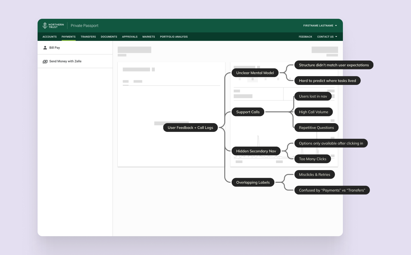
Private Passport users struggled to locate key actions such as paying bills and making transfers due to overlapping top-level navigation labels and hidden secondary menus.
I led a global navigation redesign to improve clarity, reduce unnecessary clicks, and surface sub-navigation more efficiently within the existing platform constraints.
My Role
Designer (led navigation redesign)
Audited call center logs and in-product feedback
Identified root navigation issues beyond “help” documentation
Led card sorting exercises to define improved structure
Delivered redesigned navigation system within platform constraints
Impact
Improved
Feature discoverability
Reduced
Call center volume related to basic navigation tasks
Established
A scaleable navigation structure for future feature growth
The Challenge
As Private Passport expanded, users struggled to locate high-frequency actions such as bill pay and transfers due to overlapping top-level navigation categories and secondary options that were only revealed after entering each section. This forced users into exploratory clicking, increased time-to-task, and created uncertainty around where key actions lived within the product. The result was avoidable friction in core workflows and recurring navigation-related support requests, signaling a product structure that had not scaled with feature growth.
The Solution
Clear Top-Level Structure
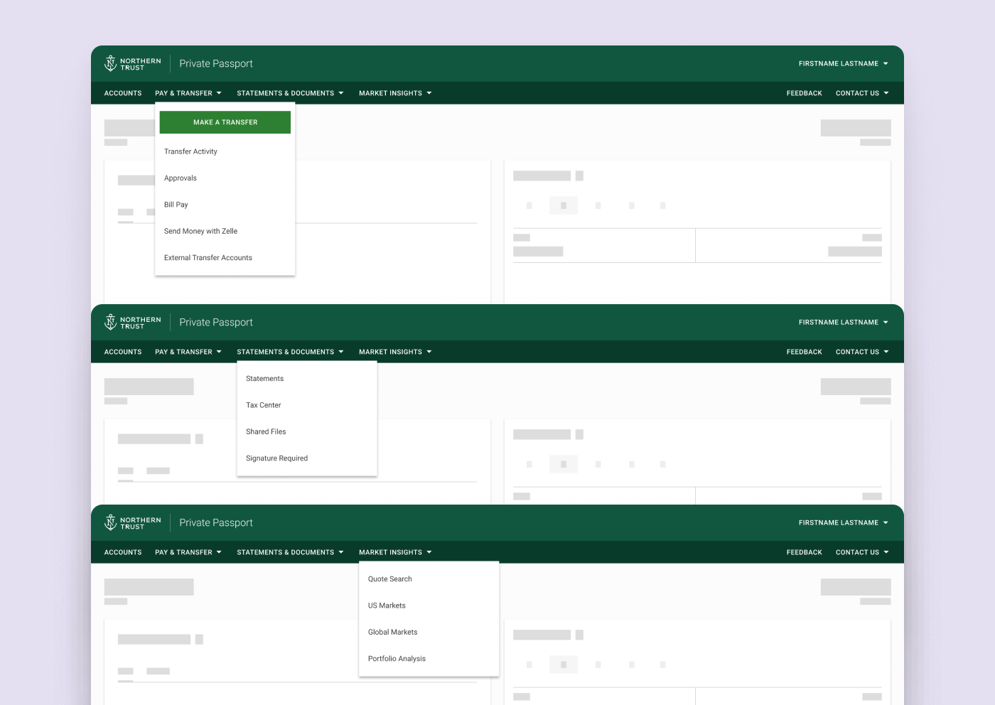
We consolidated overlapping categories (e.g., Payments and Transfers) into a unified, intuitive structure.
Hover-based Secondary Navigation
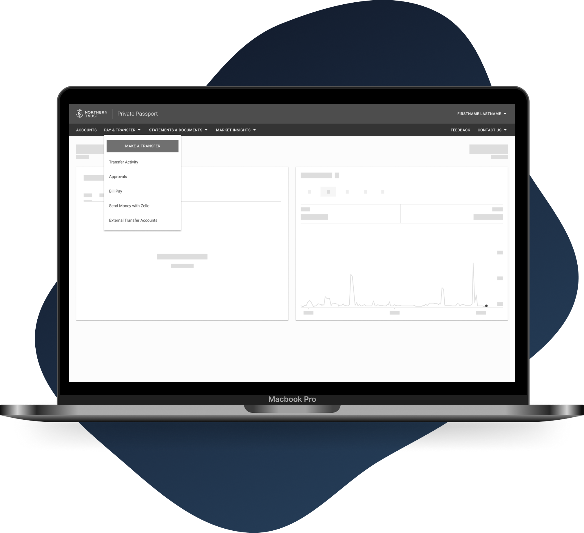
We introduced hover-triggered dropdown menus that exposed secondary options immediately, reducing clicks and improving scanability.